How I minimize phone distraction: grayscale display
This is a repost from my newsletter Makzan’s Dispatch 2020 week 16 and 17.
I apply these strategies to minimize my mobile phone distraction:
- Turning display into grayscale
- Minimal apps on home screen.
- Turning off most notifications
I have been turning my iPhone into grayscale for months. I found it an effective way to minimize distractions from the phone.
Turning display into grayscale

Since the debut of the iPhone and Android, our life has forever changed. We frequently hold up our phone unintentionally for no reason. Then, we fall into the distraction black hole and come back only after realize that time wasted for minutes or hours. Often, a single action such as checking a work message becomes checking Instagram, Twitter and reading email newsletters and reply messages.
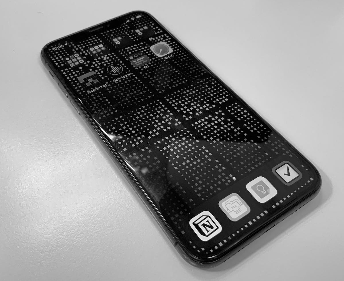
My solution to this distraction black hole is to turn it into grayscale. It suddenly makes the phone boring to look at. So even I slightly get distracted there, the colorful physical world will grab my attention back from the grayscale display.
Occasionally, I will turn the color back on, but I will make sure I turn grayscale back afterward. During early April, I tried for days turning the phone back into colorful mode. You guessed it, I lost time again using the phone with such color and attractive display. Then I turned the phone back to grayscale and now I have more control of my time.
If you want to try, you can turn the iPhone display into grayscale under the accessibility and color filters setting. In Android, I find that is model by model. During the first day using grayscale display, you may find uncomfortable using your phone. After a few days, hope you will start finding the beauty of contrast and shading patterns when using apps. Also, you will learn which apps use bad color contrast on the user interface.
Remove apps from home screen
I frequently review which apps I keep on my home screen.

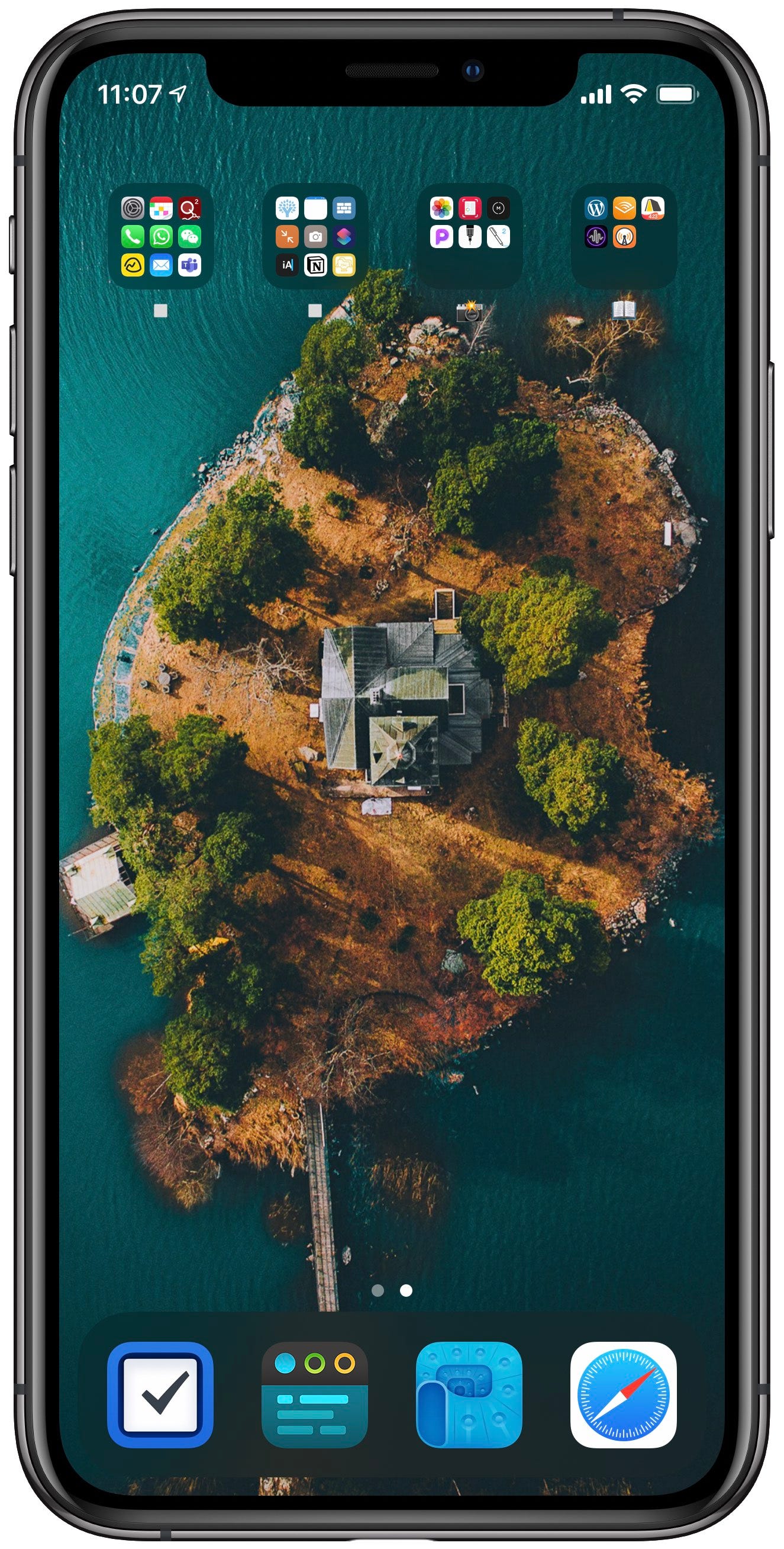
This is my current home screen. The wallpaper is from the WLPPR app. It is an island in Sweden.
My rule of thumb when setting up my home screen:
- 1 and only 1 page.
- Most frequently apps in the dock. They are
- Things
- Tot
- DEVONthink
- Safari
- Often used apps on the first page of folders in top rows. Some of them are Settings, Calendar, Communications, Photos, YNAB budgeting app. The four folders are categorized as:
- Core apps
- Aside apps
- Photos related apps
- Reading-related apps
Turning off notifications
Most notifications are either turned off or in the notification center only. They are hidden in the lock screen, not popping up as banners, never produce sounds and no icon badges at all.
Now I have fewer chances to get distracted by apps. I control my phone and I only use it when I have a purpose to use it. Also, my home screen is grayscale most of the time, making it less attractive.
Published on 2020-05-03 by Makzan.
More articles like this:
-
Email newsletter
-
Highlighted
-
Productivity
Previous ← TIL: git checkout is now two commands: git switch and git restore
Next → Quick Sketch: My Workspace